


The company mascots, Phil (Bull) & Marty (Bear) are personifications of their respective style of trading, the idea was to create a running blog with content reflecting respective trading styles. These were the emblems I came up with for the blog.
Blog posts characterizing "bull-ish" trading would be emblemized with this logo.

"Bear-ish" style blog posts would be indicated by this icon for the blog

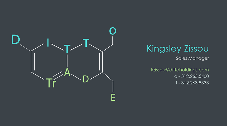
An ode to my chemistry days – This logo proposal worked portrayed the unifying branding message the company was trying to portray.
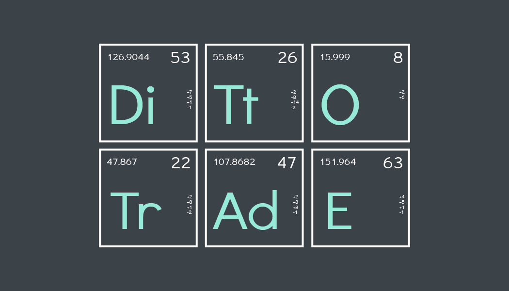
A tribute to Breaking-Bad, this periodic-elements logo was one of my favorites aestethically.
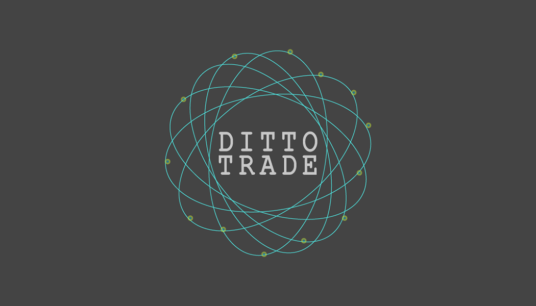
"Ditto-ing" could have a decentralized connotation approach than we preferred. The logo was developed to hint "centralized" messaging.
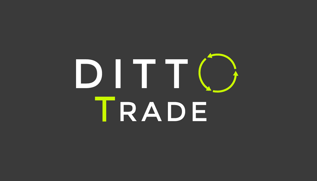
The company was reimagining their branding approach - market as a technology tool for traders and this logo was given to our partners to feature on their sites
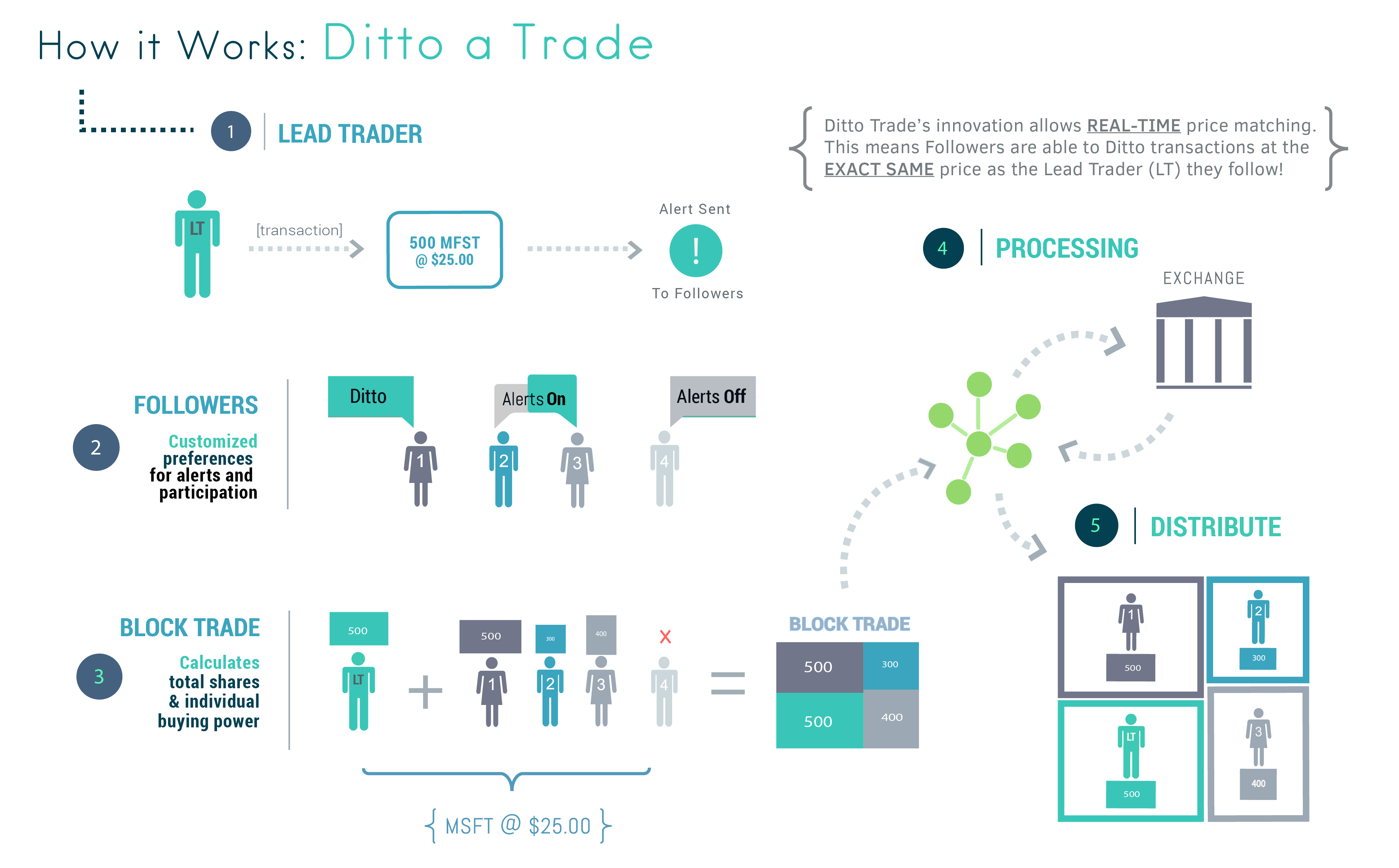
The previous"How-To" graphic for visitors to the site was outdated, so I adapted an infographic. The next step would have been to make the whole thing an animation.
Dark Logo Color Scheme. For a little more contrast
Light scheme adaptation of the updated logo
Intranet site that I had set up and this was the logo I adapted for it
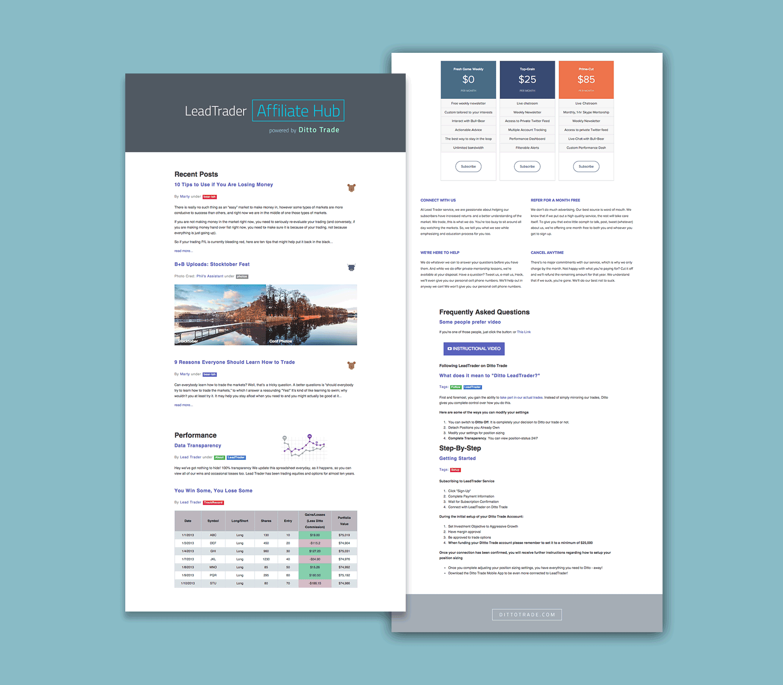
Microsite for affiliate marketing and B2B customers. Provided LeadTrader accounts with content advice, marketing collateral, compliance guidelines, etc.
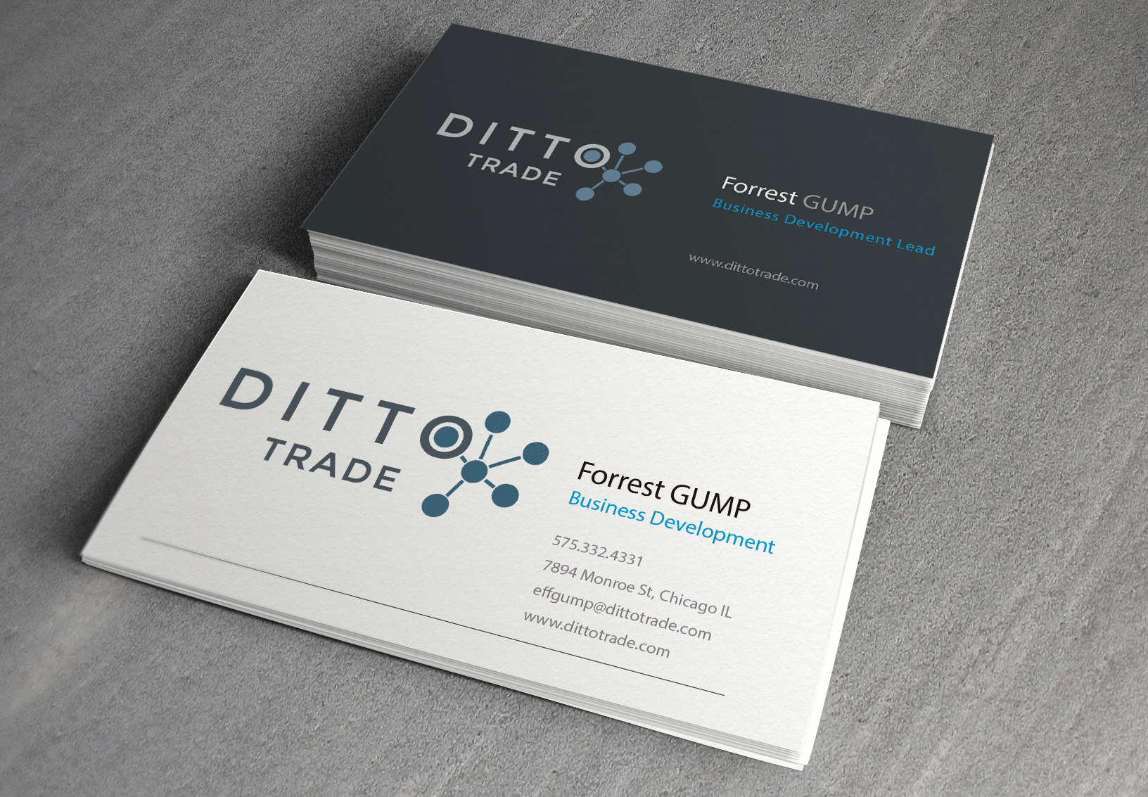
More mockup examples for the updated logo

 Raleigh St. Claire